

“Over the years we’ve invested significantly in our field data team - focusing on producing trusted ratings. While this ensures the accuracy of our Ratings, it doesn’t allow the scale across the thousands of projects that buyers are considering.”

For more information on carbon credit procurement trends, read our "Key Takeaways for 2025" article. We share five, data-backed tips to improve your procurement strategy.
One more thing: Connect to Supply customers also get access to the rest of Sylvera's tools. That means you can easily see project ratings and evaluate an individual project's strengths, procure quality carbon credits, and even monitor project activity (particularly if you’ve invested at the pre-issuance stage.)
Book a free demo of Sylvera to see our platform's procurement and reporting features in action.
Why Dashboards Matter (If They’re Built on Verified Data)
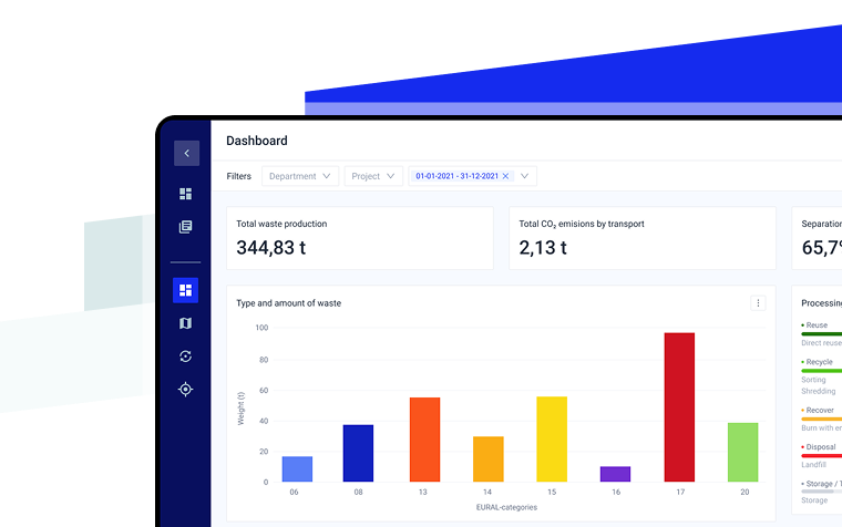
A waste management dashboard is only as useful as the data it is based on. Without the right expertise, it’s just a prettier version of the same spreadsheets and monthly PDFs — or another static page that looks good but doesn’t help anyone make better decisions. But when it’s built on verified, standardised and traceable data, a dashboard becomes a genuine decision-making tool.
A good dashboard highlights what spreadsheets hide: trends, outliers and opportunities to reduce costs or improve recycling rates and overall operational efficiency across every facility in your waste management network.
For example, imagine your dashboard shows a sudden spike in incineration. At first, it might look as though your waste processor has changed methods, but on closer inspection, you discover a one-off project that produced a large amount of contaminated wood material that couldn’t be recycled safely. Instead of jumping to conclusions, the dashboard helps you see the story behind the numbers and act accordingly.
Different roles will see different value. Executives need high-level key performance indicators (KPIs) to track cost and sustainability goals. Operations teams need daily visibility of issues they can act on. Compliance teams require transparent and traceable data for effective audit trails. The same dataset, viewed through the right lens, enables each team to make faster and more confident decisions, ultimately leading to better results.
But remember: a dashboard is only as reliable as its data. Even the best design can mislead if the information behind it isn’t verified. Building systems to check and standardise your data must go hand in hand with creating the dashboard; otherwise, you’re just decorating the problem.
4 Examples of Waste Management Dashboards (By Role & Decision)
A well-built dashboard only matters if it helps people make better decisions and improve processes. To do that, it should show the correct information to the right person, at the right level of detail. Below are four examples of how waste management dashboards can be tailored to different roles within an organisation — helping teams analyze performance, address inefficiencies and achieve shared environmental and financial goals.
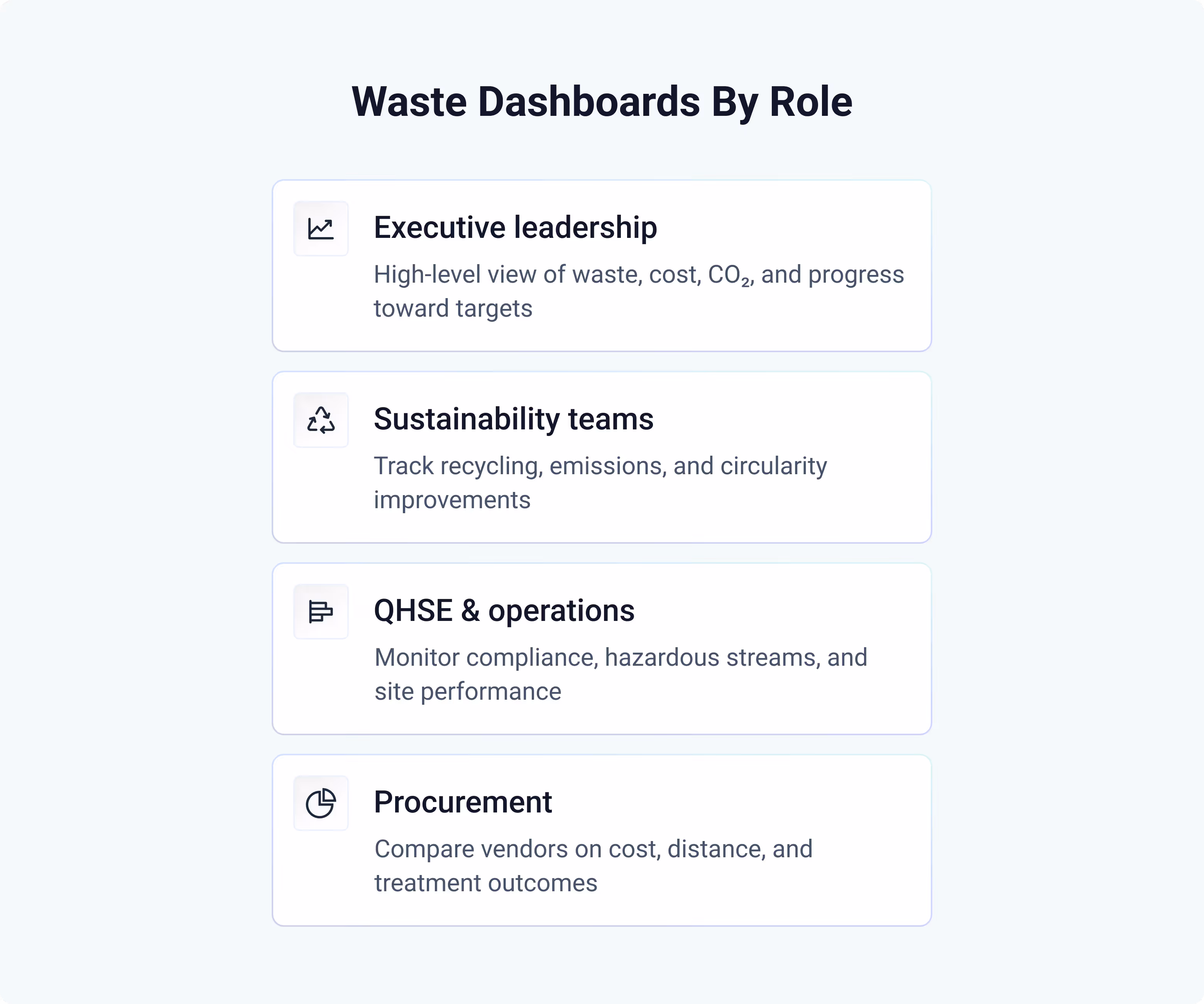
Executive Leadership
Needs a bird’s-eye view of the organisation. Their dashboard focuses on overall performance and progress towards company-wide targets — both financial and environmental. This view is often used for board reporting, annual reviews and sustainability disclosures.
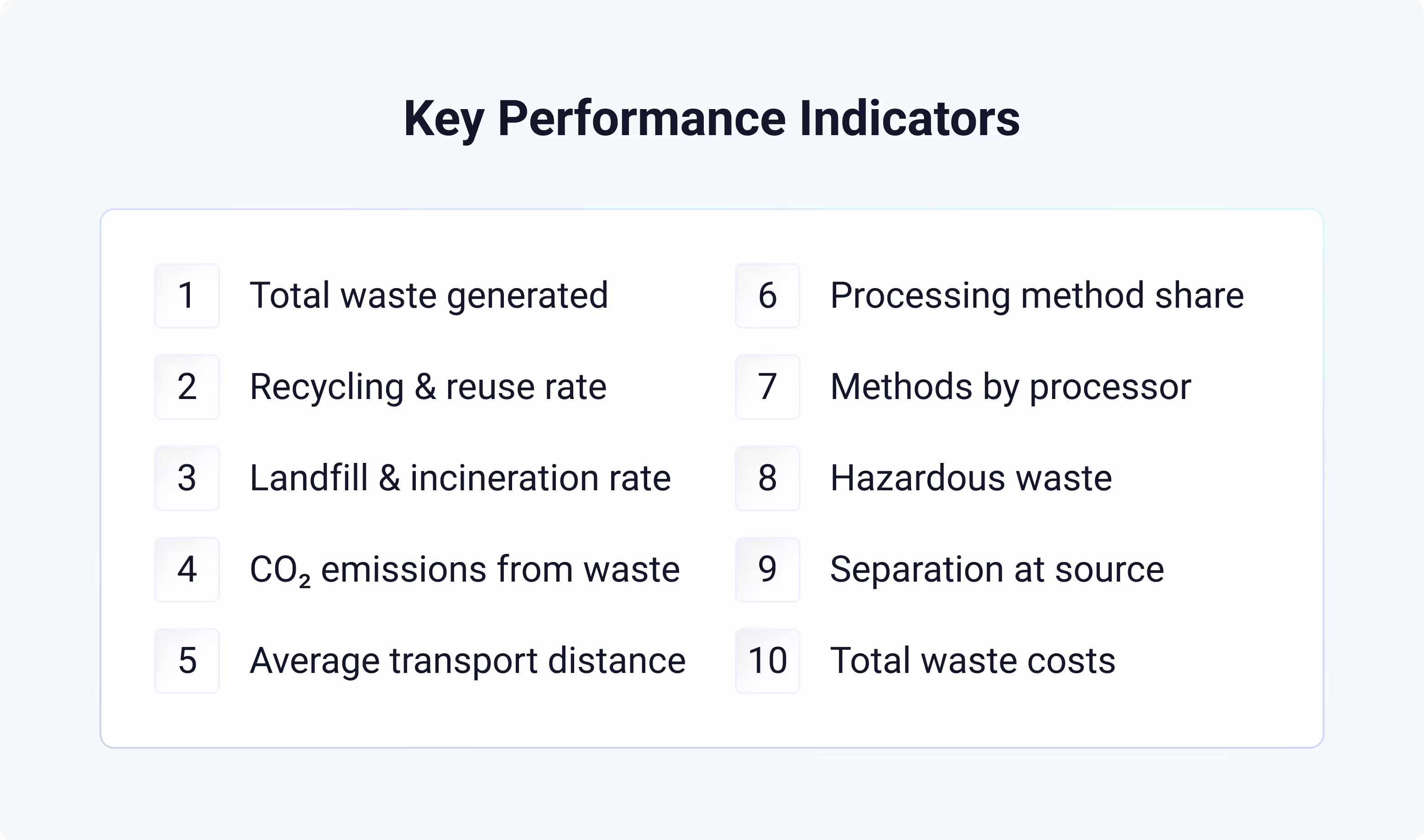
Key KPIs to measure:
Total waste generated, recycling and reuse rate, landfill and incineration rate, CO₂ emissions from treatment and transport, processing method share, and total waste costs can be a part of what to search for .
How that can be visualized:
Long-term trends in waste quantities and materials, performance per country or site, the overall distribution of treatment methods, and CO₂ contribution by site and material type.
Sustainability Teams: Improving the Circular Economy
Focused on understanding environmental performance and identifying where improvements can be made to reach sustainability goals. These dashboards help prioritise actions that reduce emissions, increase recycling and drive overall waste reduction, circular economy initiatives and continuous improvement.
Key KPIs to measure:
Total waste generated, recycling and reuse rate, landfill and incineration rate, CO₂ emissions from treatment and transport, processing method share, and average transport distance, and separation at source.
How that can be visualized:
Trend lines for key environmental metrics, breakdowns by material or treatment type, and opportunities for reduction, reuse or circular improvement can be used to filter important information .
QHSE & Operations (E-waste and other hazardous waste type)
Needs to ensure waste is handled correctly, safely and in full compliance. Their dashboard provides day-to-day visibility of each facility — what has been collected, whether documentation is complete, and whether procedures meet environmental regulations. Dashboards at this level can also support monitoring of specific streams, like e-waste tracking and management, ensuring hazardous and electronic materials are handled in line with environmental laws.
Key KPIs to measure:
Total waste generated, recycling and reuse rate, landfill and incineration rate, processing method share, processing methods per processor, hazardous waste, and processor separation at the source.
How that can be visualized:
Performance comparisons across sites, breakdowns of hazardous materials, and trend lines showing quantities and treatment routes over time.
Procurement
Manages contracts with waste processors and ensures the company works with the right partners. Procurement dashboards combine financial and operational insights to guide vendor selection and contract management, ensuring a net benefit for the organization. They help teams explore their cost-performance against industry benchmarks, map processor locations and filter by waste type to identify better technologies or partners.
Key KPIs to measure:
Recycling and reuse rate, average transport distance, processing method share, processing methods per processor, and total waste costs.
How that can be visualized:
Maps showing processor locations and proximity, overview table of all processors, price-versus-processing method plots, and overview highlighting potential cost and CO₂ savings.
KPI Library — Definitions, Formulas and Thresholds
Each key performance indicator helps measure efficiency, environmental impact and progress towards sustainability goals, whether expressed as a percentage, cost or absolute value.
Total waste generated (t) = sum of all tonnes collected (by site, material and treatment).
Gives the overall waste footprint and provides a baseline for reduction.
Recycling and reuse rate (%) = (recycled tonnes + reused tonnes) ÷ total tonnes.
Shows how much waste is recycled or reused. This is generally the metric you want to increase as much as possible.
Landfill and incineration rate (%) = (landfilled tonnes + incinerated tonnes) ÷ total tonnes.
Shows how much waste still ends up in landfill or incineration, useful for tracking compliance and sustainability progress.
CO₂ emissions from waste (kg CO₂e) = (treatment emission factor × tonnes) + (transport distance × transport emission factor).
Combines emissions from treatment and transport to show the total climate impact of waste management, helping identify where reductions are possible.
Average transport distance (km) = total transport kilometres ÷ number of shipments.
Shows the typical distance waste travels before treatment and highlights opportunities to shorten routes.
Processing method share (%) = tonnes of waste per processing method ÷ total tonnes.
Shows the treatment mix (reuse, recycling, recovery and disposal).
Processing methods per processor (%) = tonnes treated by a given processor per method ÷ that processor’s total tonnes.
Reveals each processor’s actual treatment profile and allows fair comparison between vendors.
Hazardous waste (t) = total amount of hazardous waste (by site, processor or material).
Reveals the source and composition of hazardous waste and how it is treated.
Separation at source (%) = separated recyclable tonnes ÷ total recyclable tonnes generated.
Measures the quality of on-site segregation, a key lever for higher recycling rates.
Total waste costs (€) = sum of all waste-related costs (collection, treatment, transport and surcharges).
Tracks total spend and supports budgeting, benchmarking and vendor negotiations.
Tip — set threshold bands: For example, target CO₂ per tonne by material, landfill below 5%, recycling above 70%, separation rate above 60%, or average transport distance by region. Use amber/red bands to trigger action and reviews.
Data You Need Behind the Waste Management Dashboard (and How to Trust It)
A dashboard is only as strong as the data behind it. If your waste data isn’t consistent or verifiable, every chart risks becoming guesswork. Reliable insights depend on having clear sources, standard formats and transparent traceability.
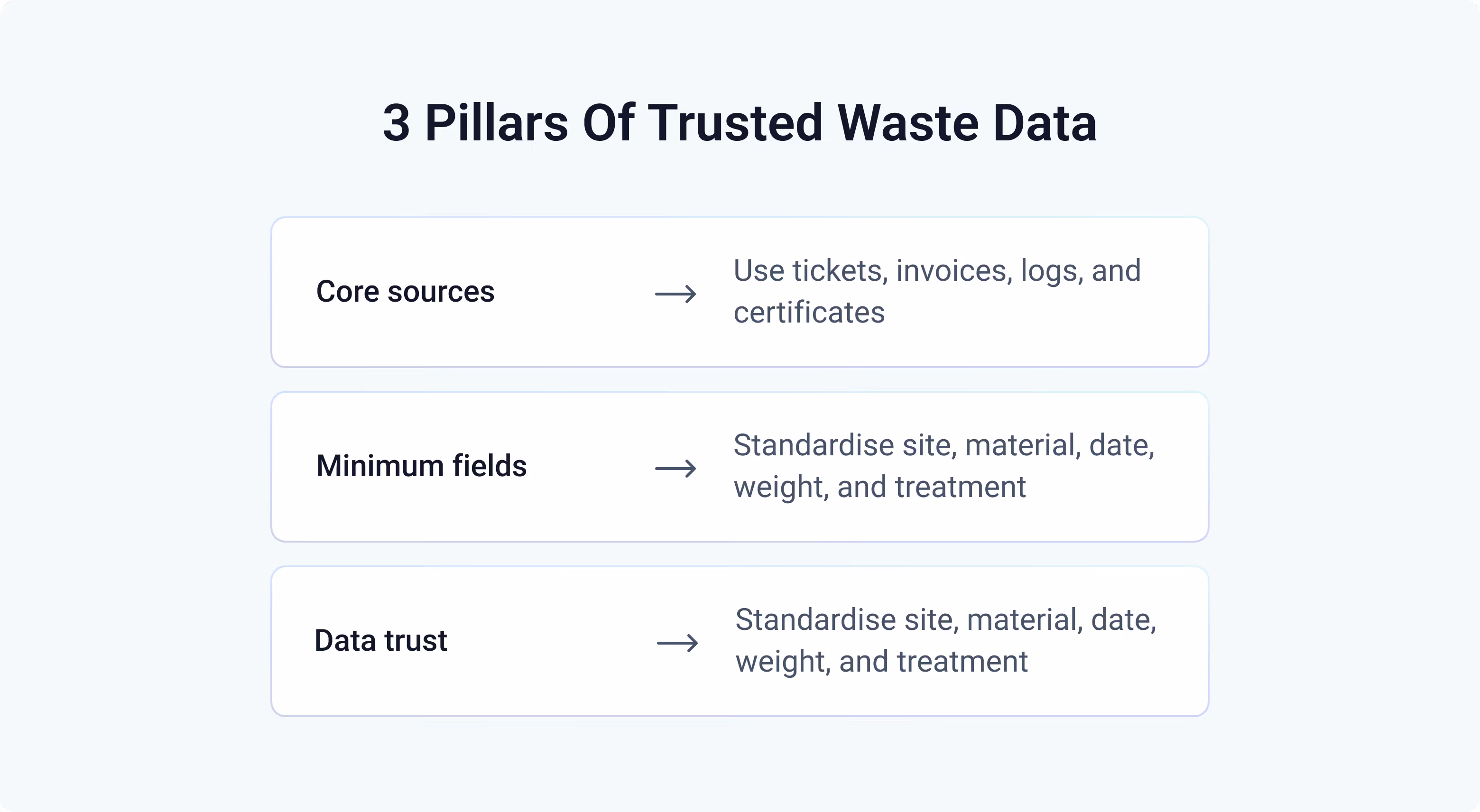
Core Sources
Good waste data comes from a few key places: vendor tickets, invoices, weighbridge readings, transport logs and processor certificates. These documents show exactly what was collected, where it went and how it was treated. Finance or ERP data helps link those movements to costs, while optional tools like sensors or vehicle tracking can add accuracy for large operations.
Minimum Fields to Capture
To make data comparable across sites and vendors, each record should contain the basics: who, what, where, when, how much and how it was treated. Standardising fields like date, site, material, weight, treatment type and processor avoids confusion and makes analysis reliable.
Making Data Trustworthy
Trust comes from transparency. Every number on a dashboard should trace back to an original document — the manifest, invoice or certificate that proves it. Automated checks for missing values, duplicates or implausible distances help keep data clean without extra manual work.
Platforms like geoFluxus automate this process: ingesting waste data from multiple vendors, standardising formats and linking every figure to its source file. This automation helps organisations address common challenges such as inconsistent reporting formats, delayed invoices and missing documentation.
ESRS E5-Ready Waste Management Dashboard Widgets
If your organisation reports under the CSRD’s ESRS E5 standard, your dashboard can do much of the heavy lifting for you. Instead of rebuilding reports every year, design widgets so that all required disclosures are already visible and ready to export.
Key widgets to include:
- Total amount of waste generated
- Total amount of non-recycled waste
- Total amount of hazardous waste
- Processing methods — split into recovery and disposal operations. For each operation type, display the waste category (EWC code or material), whether it is hazardous or non-hazardous, and total weight.
- Overall waste composition — showing all waste categories (EWC codes and materials) and their respective weights.
When combined with simple export functions, these widgets allow a one-click download of an ESRS-formatted table containing all required figures. A dashboard built this way turns reporting from a manual exercise into a natural output of daily monitoring.
Design Principles for Dashboards People Actually Use
A dashboard is only useful when it provides data that people actually use. Keep the design focused, consistent and practical — less decoration, more decision-making. The goal is to help users explore, view and learn from their data with minimal friction.
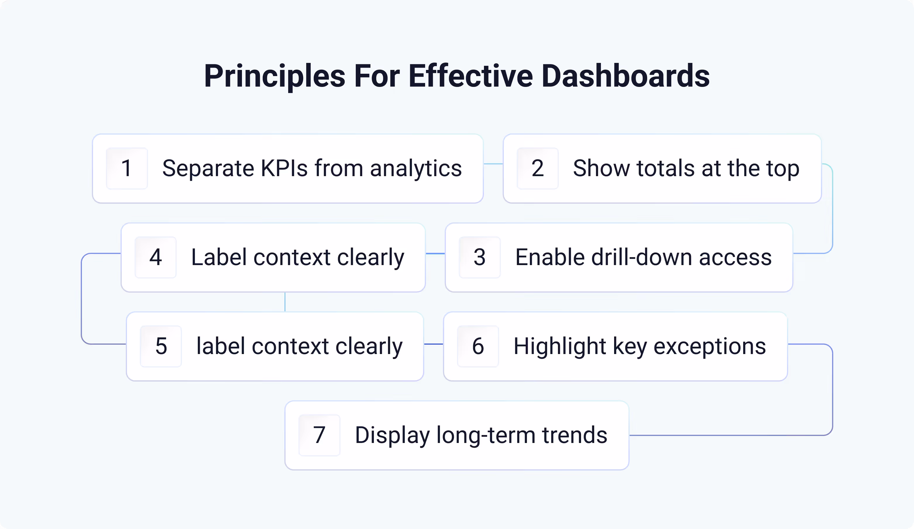
Design principles:
- Separate performance KPIs from analytics distinguish between metrics that track progress (such as waste reduction) and charts that simply describe the data.
- Show overall numbers at the top for a quick overview of total waste, recycling rate, CO₂ emissions or cost. Use tiles below for detailed splits by site, material or processor.
- Make it easy to access the data behind each chart so users can diagnose issues quickly instead of guessing.
- Keep context visible always label units, timeframes and filters so users know exactly what they’re looking at.
- Prioritise comparability by using the same scales, colours and time ranges across similar widgets to make differences stand out clearly.
- Highlight exceptions, not everything use colour or icons to draw attention to anomalies or missed targets instead of cluttering the view. Avoid overwhelming users with too many colours; use them intentionally.
- Show trends, not snapshots always include historical data (at least 12 months) to distinguish normal variation from real change.
A well-designed dashboard isn’t just a reporting tool — it’s a shared workspace where every team can see, trust and act on the same data.
One Dashboard, Many Uses
It’s tempting to design a different dashboard for every role, but in most cases that creates more complexity than value. The same verified data can serve every team if it’s structured well. By separating high-level KPIs from analytical charts, you’re dividing by use case rather than by job title.
Executives can view progress and totals at a glance, while sustainability, operations and procurement teams can dig deeper into trends, materials or vendors — all from the same interface.
A single, well-organised dashboard keeps everyone aligned around the same metrics, reduces duplication and ensures every conversation starts from a shared source of truth. It turns waste data from something fragmented into something genuinely strategic.
FAQs
What KPIs belong on a waste management dashboard?
Focus on the indicators that reflect actual performance: total waste generated, recycling and reuse rate, landfill and incineration rate, CO₂ emissions from treatment and transport, processing method share, transport distance and total waste costs.
How do we ensure the dashboard is audit-ready for ESRS E5 or ISO 14001?
A good dashboard should also make it easy to search, filter and navigate through different views — so teams can quickly find the data they need without digging through spreadsheets.Keep every number traceable. Each figure should link directly to its source document — such as a ticket, invoice or processor certificate. That traceability makes your dashboard both audit-ready and credible.
Can we show Scope 3 emissions from waste on the dashboard?
Yes, by applying standard emission factors to transport and treatment data. This shows the climate impact of waste handling and helps identify where reductions are possible.
How often should the dashboard update?
Ideally as close to real-time data as possible — but in waste management, true real-time updates are difficult. Data often depends on vendor invoices or government reporting cycles, which can have delays of six to eight weeks. You need to account for those timelines in your setup. For most organisations, a monthly update already represents a high level of efficiency and control, as long as the schedule is consistent and clearly displayed on the dashboard.
How do we compare vendors fairly?
Normalise key metrics — such as cost per tonne, recycling rate and transport distance — by material type and treatment method. This allows like-for-like comparisons without penalising vendors handling more complex or hazardous waste.