“Over the years we’ve invested significantly in our field data team - focusing on producing trusted ratings. While this ensures the accuracy of our Ratings, it doesn’t allow the scale across the thousands of projects that buyers are considering.”

For more information on carbon credit procurement trends, read our "Key Takeaways for 2025" article. We share five, data-backed tips to improve your procurement strategy.
One more thing: Connect to Supply customers also get access to the rest of Sylvera's tools. That means you can easily see project ratings and evaluate an individual project's strengths, procure quality carbon credits, and even monitor project activity (particularly if you’ve invested at the pre-issuance stage.)
Book a free demo of Sylvera to see our platform's procurement and reporting features in action.
You Can’t Improve What You Can’t See
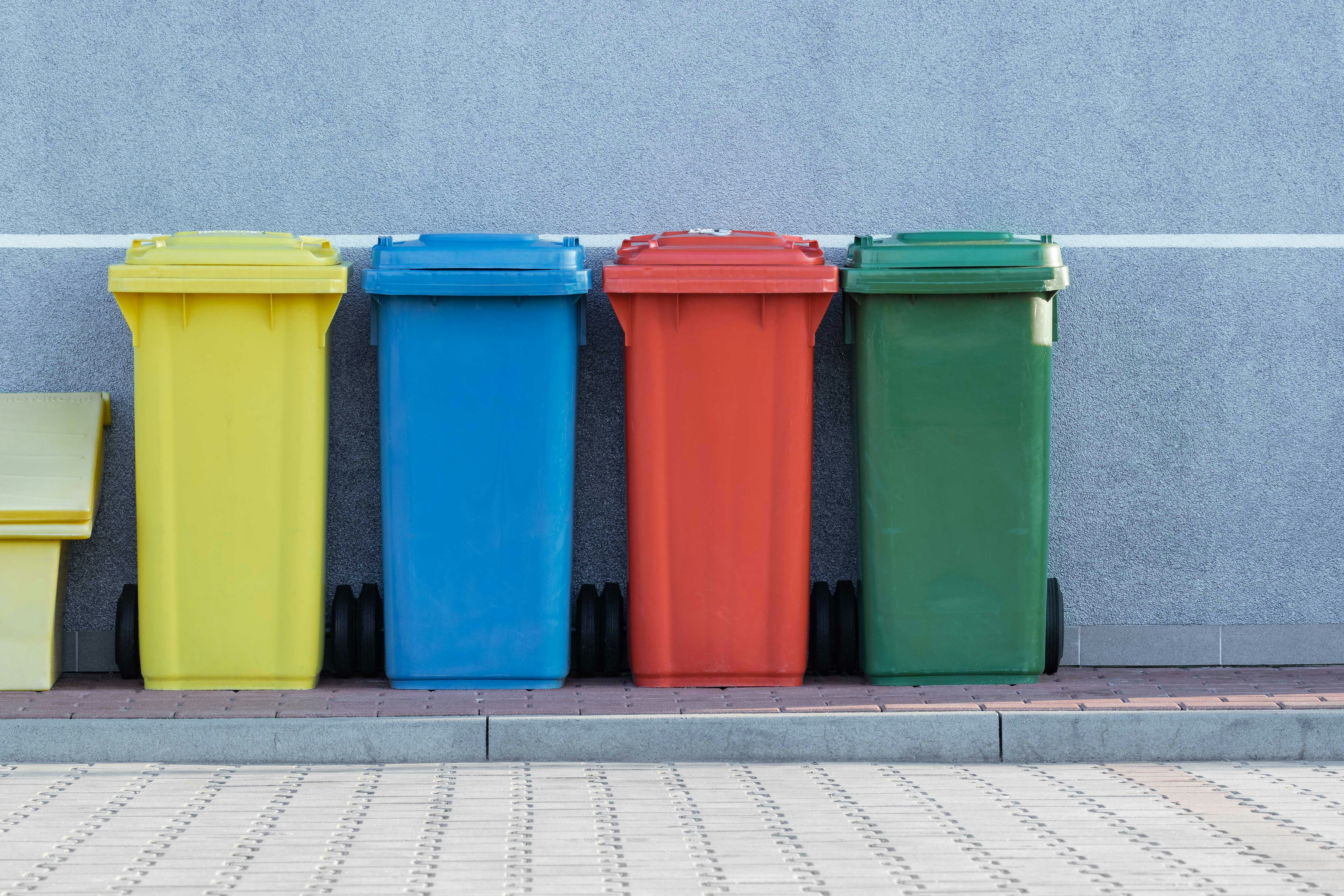
Most organisations are expected to reduce waste, improve recycling rates, and build circular practices into operations. Leadership teams set targets, project teams launch initiatives, and procurement negotiates better recycling terms. Yet progress stalls quickly because waste becomes almost invisible the moment it leaves a production line or office. It moves into containers managed by contractors, returns only through fragmented documents, and rarely forms a coherent picture. Circularity becomes difficult not because teams lack ambition, but because the system they must improve is effectively hidden.
This invisibility becomes clear when teams try to understand their waste flows. They turn to spreadsheets, PDFs, vendor reports, or site-level inventories. Each document shows a small part of what is happening, but never the whole. These fragments do not reveal how flows differ between sites, how contractors apply different treatment routes, or where valuable materials are lost along the way. Unverified and inconsistent data leads organisations to operate with outdated processor choices, inefficient routes, and a lack of insight into where circular value is leaking from the system.
What Is Waste Stream Mapping (and Why It Matters)?
Waste stream mapping is the systematic visualisation and analysis of how materials leave an organisation. It shows the origin of each waste stream, how it moves through internal handling and contractor logistics, the quantities involved, the treatment methods used by processors, and its final destination. By turning these movements into clear visual flows or charts, waste stream mapping makes the behaviour of the waste system visible and exposes where material value is retained or lost.
In practice, mapping can take different visual forms depending on the question being asked. Some maps illustrate how streams move from one site to another and in which volumes. Trend visualisations reveal how specific streams change over time, making increases, reductions or seasonal patterns easy to recognise. Treatment charts show how materials are processed at different facilities, distinguishing between reuse, recycling, recovery and disposal. Transport maps highlight which streams contribute most to CO₂ emissions by showing travel distances and movement intensity. Processor visualisations reveal differences in treatment performance between vendors.
What Mapping Uncovers (The Benefits in Practice)
When waste flows become visible, organisations start to understand their system in a completely different way. Patterns that were buried in spreadsheets suddenly reveal themselves, and decisions that once relied on assumptions can be made with confidence.
Map View
A map changes how organisations understand their waste because it shows flows in the context of real geography. When all streams appear as lines between sites and processors, patterns that were invisible in charts become obvious. Clusters form around certain regions, volumes concentrate along particular routes, and isolated sites stand out immediately. This spatial view gives teams an intuitive sense of what is happening, without needing to analyse multiple spreadsheets or reports.
Seeing flows on a map also reveals the practical consequences of current decisions. A site that sends small volumes to a distant processor becomes immediately visible; so does a facility that regularly ships recyclable material to a location that is much further away than necessary. These are not abstract inefficiencies — they translate directly into higher transport costs, avoidable emissions and unnecessary time spent coordinating logistics.
Most importantly, the map view makes improvement opportunities obvious. A shorter route becomes easy to identify. A processor located closer to several sites becomes an opportunity for cost and emission reduction. A site with unusually high volumes becomes a candidate for waste prevention or on-site sorting improvements. The map turns the waste system into something you can act on, not just report on.
Transport
Mapping transport flows adds another layer of insight. It shows not only how far each stream travels but also the associated emissions and operational impact. When the movement of waste is visualised as lines of varying distance and intensity, streams that contribute disproportionately to CO₂ quickly stand out. This allows teams to consider alternative processors, reduce transport burdens, and lower both environmental impact and cost.
Real Behaviour of Processors
Processor performance often looks similar on paper, but mapping reveals the differences that matter. A visual breakdown of treatment outcomes shows how each processor manages specific materials: how much is truly recycled, what portion is recovered, and what still goes to disposal. A vendor may promise recycling, yet the mapped data may show that only a fraction is actually recycled. Once these discrepancies become visible, organisations can direct materials to processors who deliver higher-value outcomes and avoid those who underperform.
Recognising Trends Hidden in Aggregated Data
Visualising trends over time uncovers patterns that static annual summaries obscure. Some streams rise gradually without being noticed; others spike at predictable points in the year. By seeing changes as continuous lines rather than cumulative totals, teams can anticipate periods of high volume, detect emerging waste types, and intervene earlier. This transforms waste management from reactive clean-up to proactive planning.
How Organisations Can Map Their Flows
Step 1: Collect the Data Your Organisation Already Has
The process begins by bringing together the waste information that already exists across your sites, contractors and internal systems. This usually includes waste tickets, transport documents, processor details and invoices. As soon as this information is combined, the first inconsistencies appear: the same material coded differently at different sites, processors described in several ways, or missing treatment information. These variations are normal and surface only when data is viewed side by side.
Step 2: Align Everything Into One Structure
Once the data is collected, it needs to be standardised so that all streams follow a shared format. Material codes are harmonised, site and processor names are made consistent, and transport and volume details are brought into comparable terms. This step turns fragmented contractor data into a unified dataset that reflects how materials move across the organisation rather than how each vendor presents their records.
Step 3: Visualise the Flows
With structured information, the waste data can be translated into visual form. Charts and trendlines are often the first output because they can be generated as soon as the information is aligned, helping teams recognise patterns across sites or throughout the year. But the most powerful visualisation comes from seeing all flows on a map. Building this kind of map internally is difficult, because it requires accurate locations for every site and processor, reliable transport routes, and continuously maintained geospatial data.
geoFluxus provides this map automatically. The platform includes a built-in interactive flow map that visualises your organisational data, so the routes you see reflect how materials move in reality. As new data arrives, the map updates on its own. This gives organisations an accurate, up-to-date view of their waste system without the tedious effort of maintaining maps themselves.
Step 4: Interpret the Insights and Decide on Improvements
After the flows are visualised, teams from sustainability, operations, and procurement can review the system together. These discussions reveal where transport should be improved, which processors deliver stronger outcomes, which streams travel unnecessarily long distances, and where waste might be reduced at the source. Mapping becomes the basis for practical interventions such as adjusting contracts, shifting processors, improving sorting or exploring reuse opportunities between sites.
Step 5: Keep the Maps Updated Over Time
Mapping is most effective when it becomes part of a continuous improvement process. Once the initial structure is in place, new data can be added regularly and the maps updated to reflect changes in volumes, vendors, processes or operational patterns. This gives teams ongoing visibility and allows organisations to see the impact of their decisions as the waste system evolves.
The Role of geoFluxus
geoFluxus takes care of the hardest part of waste stream mapping so organisations don’t have to. We apply the geospatial and visualisation layer, but we also do the work that comes before it: bringing together waste data from multiple sites and contractors. This is where most mapping projects stall, because formats, codes and reporting styles rarely align. geoFluxus resolves this by consolidating all information into one structure and verifying it against national waste registries, ensuring that processor locations and treatment routes reflect what happens in reality rather than what is written on paper.
Once this verified foundation is in place, the platform generates the visualisations that make waste systems understandable. Flow maps show how materials move between sites and processors, treatment charts reveal what actually happens to each stream, and trendlines highlight patterns that only emerge over time. The geospatial layer updates automatically as new data arrives, giving teams a continuously accurate view of their waste system.
With this clarity, organisations can quickly see where transport distances can be improved, which processors deliver the strongest outcomes and where circular opportunities exist. geoFluxus turns waste stream mapping into an ongoing capability that supports continuous improvement rather than a one-off analytical exercise.
Conclusion
Circular improvements start with visibility. When organisations can see how materials move—where they are generated, how far they travel and how they are actually treated—they gain the clarity needed to make better decisions. Waste stream mapping turns a previously fragmented system into an understandable one, revealing where value is lost and where changes will have the greatest impact. By consolidating data, verifying processors and generating maps and trendlines automatically, geoFluxus makes this level of insight accessible and sustainable over time. With a clear view of their waste system, organisations can shift from reactive management to proactive, circular resource strategies that are grounded in real behaviour rather than assumptions.
FAQs
What is waste stream mapping?
Waste stream mapping is the analysis and visualisation of how waste materials move through an organisation. It represents each stream in a visible form, showing where it is generated, how it flows through operations, which suppliers or services are involved, and how it is ultimately treated. By making the entire process easy to see, stream maps help companies identify inefficiencies, reduce waste, and find opportunities for recycling or resource recovery. The result is a clearer understanding of how materials and processes behave, which supports continuous improvement and more sustainable practices.
How does waste mapping support CSRD/ESRS E5 reporting?
Mapping creates a complete and verified picture of waste flows, which makes it easier to report accurate treatment outcomes, destinations and recycling rates. Because waste stream data is visualised and aligned with real processor information, companies can represent their environmental performance more reliably. Although ESRS E5 is not the reason organisations map their flows, the accuracy and transparency of a well-structured stream map significantly reduces reporting effort and supports ongoing compliance work.
What data do you need to start waste mapping?
Most organisations already hold the information needed to create a waste stream map. Waste tickets, transport records, processor details, invoices, material codes and site-level notes form the basis for mapping. Once this data is aligned into one structure, it becomes possible to analyse flows, identify inefficiencies in tasks and processes, and develop improvements in layout, routing or treatment. The ideal starting point is simply gathering what already exists on paper or in internal systems and bringing it together for analysis.
How does waste stream mapping differ from value stream mapping?
A value stream map focuses on the manufacturing process itself, showing how components, tasks and employees move through production. Its goal is to reduce wasted time, excess inventory and operational costs through lean process improvement. Waste stream mapping sits outside the production line: it tracks how discarded materials leave the organisation and how they are handled by suppliers, processors and services afterward. Both share a common purpose—improving efficiency across the entire process—but they apply to different parts of the organisation. Together, they help companies learn, improve and optimise resources more effectively.
How can geoFluxus help automate waste flow verification?
geoFluxus acts as a tool that brings all waste data into one place, verifies it against national waste registries and turns it into reliable maps, charts and trendlines. This automation removes the manual work of checking processor information, matching locations or reconstructing flows. As new data is performed and updated, the platform keeps the stream map current, helping organisations find ways to improve, reduce transport distances, enhance recycling performance and support continuous improvement across operations. It turns waste mapping into an efficient, ongoing practice rather than a one-off project.